Reasons to be optimistic about Architectural and Aesthetic trends for the 2020s
Contrasting the architectural aesthetics of the 2020s with the 2010s
While it is still early into the 2020s, there is already a major shift in architectural and aesthetic trends. The architectural aesthetic of the 2010s was defined by a specific genre of minimalism, which there is now a shift away from. The architectural aesthetic of the 2010s is encapsulated by corporate boardrooms with all glass and grey walls, Apple stores that look like mini airport terminals, and shopping centers that feel like hospitals. Overall a very corporate, sterile, and austere aesthetic.
Peak 2010s Office Aesthetic
-Creative Artists Agency building in Century City, district of LA (Source: Wikipedia)
Postmodernist architecture became popular throughout the late 20th Century, especially the 80s and 90s, and was a reaction against the austerity, formality, and lack of variety of modern architecture, especially the International Style. Postmodernism is defined by the use of bright colors, asymmetry, ornate features, and barrowing from past genres such as Victorian, Art Deco, and Neo-Classical. Post-modernism was replaced by a new minimalism, or revival of Modernism, a trend that actually began in the 2000s. However, this new minimalism did not gain total hegemony until the 2010s, as the 00s had some overlap between minimalism and Postmodernism.
Looking at LA shopping centers of the 00s, Rick Caruso’s, The Grove, which opened in 2002, and his Americana at Brand, which opened in 2006, sought to recreate a historic aesthetic in a Disneyesque sense. In contrast, the Beverly Center underwent a very minimalist renovation from 2007-8, and Westfield’s Century City Shopping Center, a similar renovation in 2004. The new aesthetic of the 2020s seems to be some return to Postmodernism while not totally rejecting Modernism and minimalism either. Basically some fusion between Modernism and Postmodernism.
Sunset Steps: proposed housing in San Francisco’s Sunset District
Source: SF YIMBY: rendering by West of West
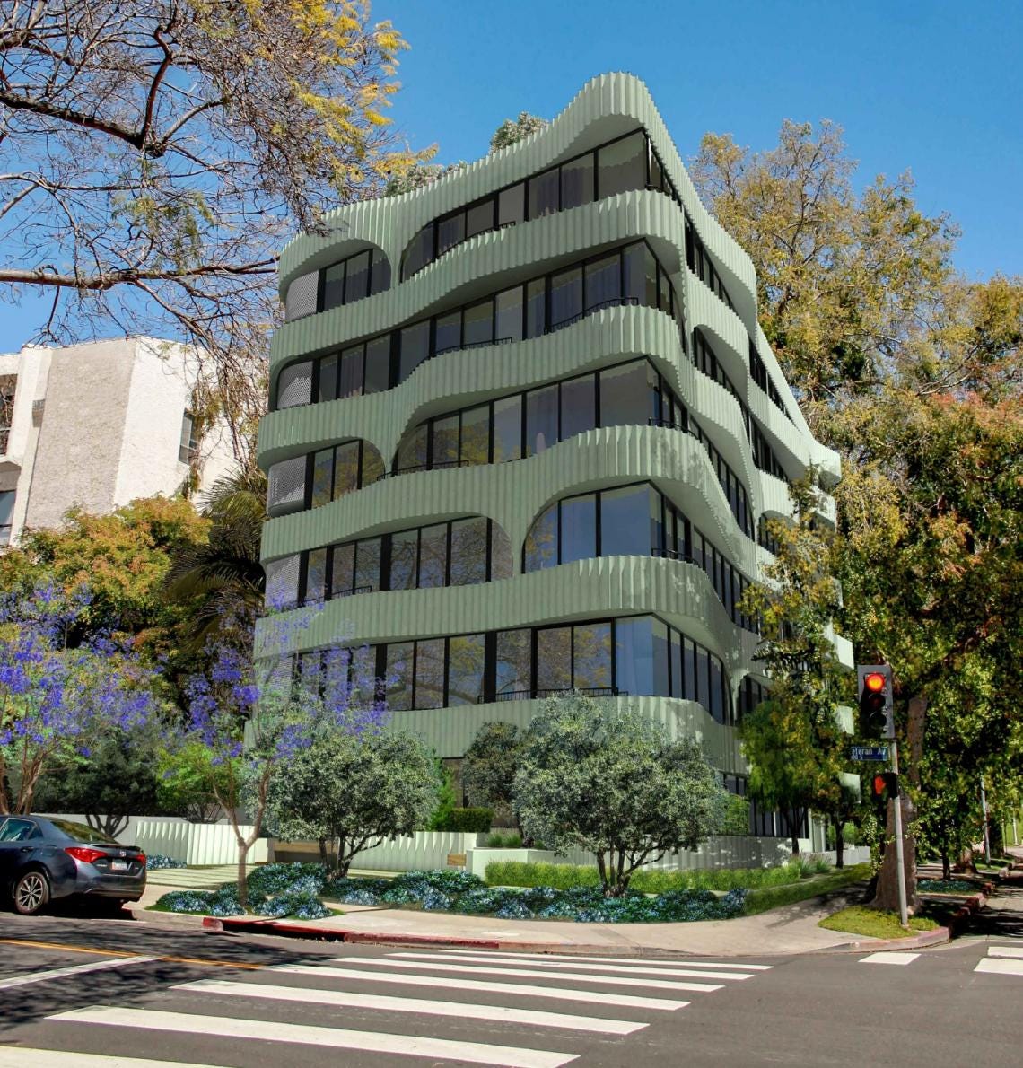
10939 Ohio Avenue, proposal in Westwood neighborhood of LA
Source: Urbanize LA, rendering via Warren Techentin Architecture
These two proposed developments, in San Francisco and in LA, epitomize a new aesthetic for the 2020s, that is just coming into fruition. With the SF project, notice the pastel pink, which is popular now, as well as Miami, Streamline Moderne, and 1960s/70s influences. The pastel green LA project has a similar aesthetic with similar pastel, a similar texture and building materials, as well as a notable Gaudi influence.
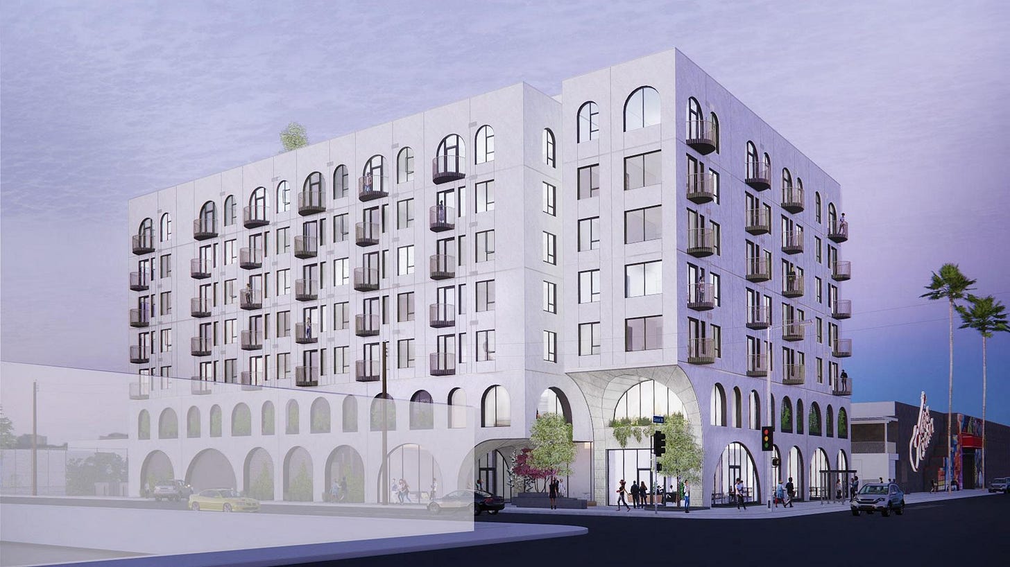
7441 W. Sunset, proposal in Hollywood
Source: Urbanize LA, rendering via Works Progress Architecture
This proposed mixed-use development in Hollywood, as well as a very similar looking project at La Brea in the Mid-Wilshire district, shows another emerging architectural trend. These mixed-use projects are usually white, with curved arch doors and windows, and have an eclectic range of influences from Streamline Moderne, 1960s and 70s, as well as Italian architecture. All of these recent projects are a vast improvement over the type of midrise development that LA and other metros have built over the past decade.
2010s mixed-use development in Downtown LA
Source: Urbanize LA
Much like how Dingbats defined LA of the 1960s, 2010s LA was defined by these boxy, stucco, podium apartments, or mixed-use developments that all look the same. Often these buildings are half stucco and half wood paneling, or have these tacky blocks of color above a podium. There are probably both zoning factors and profit motives as for why these projects are so widespread. However, this aesthetic is not totally dead with the recent example of a proposed midrise development in West LA, which looks very 2010s. Regardless, there is now much greater variety in new architecture than there was 5-10 years ago.
The Wrapper Office Tower in LA
Source: Urbanize LA via Tom Bonner Photography
There is also an aesthetic shift for high-rises from the 2010s to 2020s. High-rise projects of the 2010s tended to be all glass, cube rectangles, like the Creative Artists Agency building in Century City, as well as the high-rises built in LA by the Canadian development firm, Omni Group. In contrast with the class cube high-rises of the 2010s, 2020s high-rises are incorporating aspects of both Modernism and Postmodernism, with inspiration from past styles including 1960s and 70s Modernism, Brutalism, and even 80s and 90s Postmodernism.
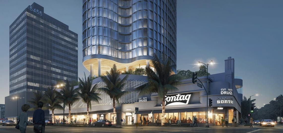
5441 Wilshire, proposed high-rise in Miracle Mile district of LA
Source: Urbanize LA
Looking at various new and proposed high-rise projects, the recently completed Wrapper office tower off La Cienega Blvd., just east of Culver City, is designed by architect Eric Owen Moss, who is best known for Postmodernist and experimental projects from the 80s and 90s. The Wrapper Tower is clearly inspired by brutalism, which up until recently had been derided and associated with public housing projects. This proposed high-rise in LA’s Miracle Mile district, has a distinctive curvy exterior and a very 60s to 70s feel, reminding me of the nearby Flynt Publications building, which was built in 1972.
Haptic & Ramboll designed timber high-rise in Oslo Norway
Source: Arch Daily
Another new trend in architecture is the wooden or mass timber high-rise. The wooden skyscraper has been made possible, in part, due to a technological breakthrough that enables timber construction to have a similar level of strength as concrete or steel, as well as changes to building codes to allow for taller wooden buildings. The Regenerative Highrise is a type of timber high-rise that has an ecologically sustainable, self-regulating system for utilities, as well as a built in modular system that can flex and change, both horizontally and vertically. These buildings function as sky-villages, that are very different from a generic skyscraper. Not to mention that they have much more character and charm than most other modern skyscrapers. While I can see some Midcentury Modern influence, this is a very new and innovative design concept.
Proposed Aman Hotel Complex in Beverly Hills
Source: Urbanize LA, rendering via Foster + Partners
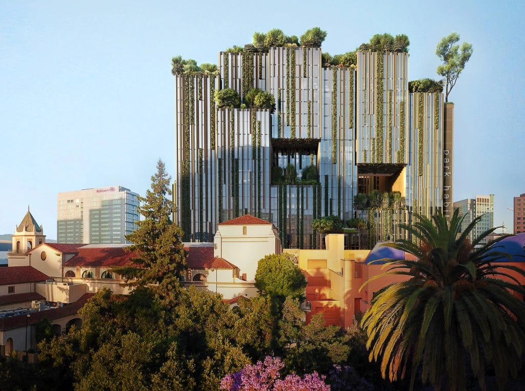
Proposed Park Habitat office tower in San Jose
Source: San Jose Mercury News, rendering via Hayes Davidson/Westbank
The timber high-rise’s counterpart is the garden tower, with a lot of potential fusionism between these genres. The garden tower is relevant to the popularity of the genres of Eco Brutalism and Tropical Brutalism, which are sort of online fantasy genres, tied to utopian visions for an ecologically sustainable future. Garden towers are most associated with Singapore, though still fairly rare in North America. However, there are an increasing number of very ambitious proposals throughout the West. One such proposal, is the very posh Aman hotel complex in Beverly Hill, which is a cross between the Singapore and Miami aesthetic. Other proposals include, a mega development on Squamish Nation reserve land in Vancouver Canada, and the Park Habitat office tower in San Jose. Even a proposed renovation for the Transamerica building in San Francisco’s financial district has aspects of this genre, and makes the best of, rather than erases, the existing 70s brutalist aesthetic. These projects are very futuristic and cutting edge, though tend to be expensive to build, especially taking into account the impending recession. Not to mention, they tend to be marketed to the ultra-wealthy.
Proposed renovation for SF’s Transamerica Building
Source: SF YIMBY rendering via Foster + Partners
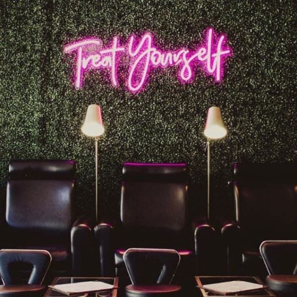
A more modest and practical counterpart to garden towers, is the growing popularity of interior greenery, a fad that was also first popularized in Singapore. The most common examples of indoor greenery are the living walls or green walls, as well as ivy, and artificial boxwood. These green walls are popular in shops, restaurants, coffee shops, salons, and hotel lobbies, as well as outdoors. So a lot of restaurants and retail spaces end up looking like floral shops.
Source: Customneon.com
There are often LED signs over a grass wall, which is generally a positive trend, even if it is a bit cheesy and will likely become dated. The look of the pink neon sign over the green wall also seems 80s inspired, as a lot of 80s malls had garden interiors. Perhaps the trend is influenced by Millennial to GenX mall nostalgia, alongside fantasy genres. It is notable that Postmodernist 80s malls were influenced by Victorian era arcades and greenhouse conservatories.
Restaurant with living walls/green walls
Source: GrowUp blog
Besides nostalgia, the current popularity of greenery is likely a reaction against the austere and unwelcoming public spaces of the 2010s. This even applies to the rise in pocket parks during the pandemic. Overall, the current interest in blurring of indoors and outdoors harkens to the Interior Urbanism of the 70s and 80s. Interior urbanism was initially a response to crime and urban decay, and the current urban crime wave is leading to the privatization of space, though a potential upside is creating more indoor urban oasis’s.
80s Mall Garden Interior
-Stratford Square Mall, Bloomingdale Illinois from Pinterest
To be continued









I find it so hard to define the aesthetics of the now. You did a great job!
You gatta stop making so many bangers Rob. Seriously the content is to hot and heavy.