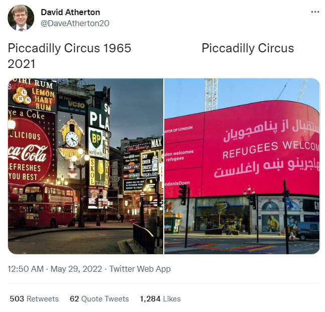
David Atherton, who is a British Libertarian Free Speech advocate and writer for Breitbart, posted a Tweet contrasting images of London’s Piccadilly Circus from 1965 to today. Atherton was making a political statement by linking the aesthetic decline to the political slogan “Refugees Welcome,” on the LED screen. The outrage from the right on Twitter was more focused on politics rather than aesthetics, but aesthetics and politics are inherently interlinked. There is a case that the message and aesthetics are both demoralizing but the aesthetics matter here as much as the political slogan. Getting worked up over the “Refugees Welcome” slogan is petty compared to the aesthetic decline. Political messages that use visual aesthetics rather than ideological arguments are more effective.
The transformation of Piccadilly Circus is relevant to my article, Woke Culture as a Minimalist Mall Renovation, about the minimalist renovation of LA’s Hollywood & Highland Mall. There have been many minimalist renovations of Post-Modernist malls, but the Hollywood & Highland renovation was the first to be linked explicitly to woke cancel culture, with the removal of the “racist” DW Griffith inspired elephant statues and a sculpture that resembled a casting couch. The Hollywood mall, built in 2001, is totally mediocre compared to vintage Piccadilly Circus, but is also an example of iconoclasm and part of an overall trend of public spaces becoming more banal. Similarly, in Blackpool UK, a retro Native American themed light display is being removed for being politically insensitive.
Contrasting the two images of Piccadilly Circus, the aesthetics represent the zeitgeists of their respective eras, with the first image screaming London of the Post War era while the other could be any public space in the world. These minimalist, antiseptic, dreary, public spaces, that feel like hospitals, encapsulate modern late-stage capitalism. These unimaginative minimalist aesthetics erase distinctions, homogenize cities across the globe, and atomize people into numb consumer units. They are the anti-thesis of nobles oblige: using minimalism to conceal power.
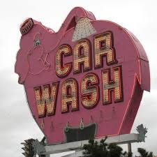
As far as responses to the images from British liberals, one commenter tweeted “Brilliant such a positive message, welcoming refugees. Thank you for tweeting,” and another British liberal tweeted “I would say it’s a 100% improvement, but these LED billboards can change ads in seconds.” On a similar note many woke urbanists were unhappy about the preservation of Seattle’s iconic pink neon Elephant Car Wash sign, with one lefty urbanist tweeting that “ok, serious question: if the city landmarks this neon sign, what does that require? neon signs are notoriously difficult to maintain. where will it be stored? who cares for it? why are we wasting time on something like this?” That comment was not overtly political but demonstrates a similar utilitarian mentality and how utilitarian left-urbanists have become.
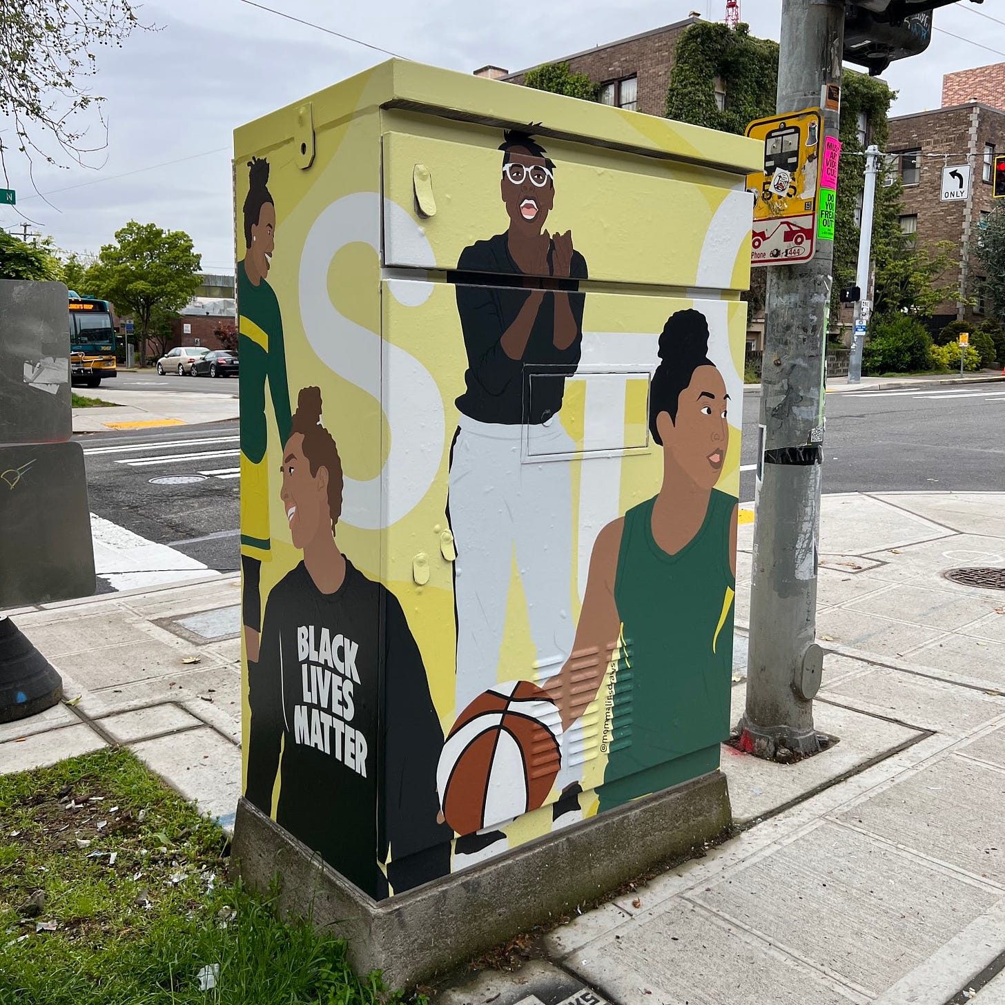
Even 10 to 15 years ago, liberals still had the upper hand on aesthetics. A lot of lefty hipster types love neon and those in the community that preserves and restores vintage neon signs lean left, as do artists and urbanists in general. However, the left no longer has the upper hand on aesthetics due to both extreme woke culture and utilitarianism. There is no cultural Avant Garde on the left anymore. Even Hipster culture was more about re-discovering and repurposing aesthetic niches, in a late capitalist sense, rather than creation in a more Promethean sense. Today’s left is encapsulated by woke corporate art, such as a public works project to put murals on signal boxes around Uptown Seattle, that looks like something straight out of a corporate diversity, inclusion, and equity training manual. Who knows, today’s woke corporate art may end up becoming the Vaporwave of the 2040s.
Woke Signal Box Art around Uptown Seattle
Normie conservatives don’t value aesthetics but at least the dissident right has embraced retrofuturism and there is a growing Bohemian right scene. Regardless, the trad right can be as narrow minded about culture and aesthetics as the left. Even the Trump movement’s original aspirational 80s retro-futurist aesthetic, embraced by younger Trump supporters, went to the wayside in favor of the County Fair aesthetic, sponsored by the geriatric donor class, ironically many of whom were moguls in the 80s.
Much like the Twitter responses from the left, many of the trad responses were dismissive of the aesthetic value of vintage Piccadilly Circus. For instance one commenter stated that “does the hyper liberal consumerist economy of the left inevitably lead to the Woke Civilization Crusher of the right?” Indian Bronson, who is usually spot on, pointed out that “The first led to the second.” However, those points are not entirely wrong, in that the same forces of capitalism and consumerism that created neon, discarded it later on. It is true that neon signs were built to be temporary and that there are practical issues about their maintenance. Despite lacking the whimsical, magical, and ethereal aura of neon, bland LED signs make more sense from a purely utilitarian and profit-margin standpoint, as they can have multiple advertisements. There has been a revival in neon but on a small scale, such as in bars.
Neon represents the promethean spirit of optimism and innovation of earlier stages of capitalism, that has been lost in late stage capitalism. However, Neon initially garnered scorn from both traditionalists and leftwing anti-consumerists. For instance in Simon & Garfunkel’s Sound of Silence, the “Neon god” referenced in the lyrics, represented crass commercialism, in contrast to the neon nostalgia of today. There is irony in these boomer left icons using the term “Neon god,” which sounds like the name of a fashwave artist or a neo-pagan retro-futuristic occultist. Also there are historic ironies that the inventor of Neon signage, Georges Claude, was a French fascist collaborator in World War II.
The appeal of the aspirational genre of Retrofuturism is in part a reaction to how the essence of liberal capitalism is that everything is disposable. Retrofuturism is a longing for lost futures and the alternative future that we should have had. It is different than just wanting to go back in time or freezing change, which reactionaries and traditionalists try to do. It addresses the problem of each era being transient by seeking to create something forward thinking and more permanent, yet borrowing from eras of the 20th century. Alt-Centrist and friend of this blog, Matt Pegas, wrote in Politics of Aesthetics Revisited that “No one would argue that the mall and the Cathedral are aesthetically equivalent, but many would, and have argued, that they share some common thread of function and spirit conspicuously absent from the culture of the present day,” but “that things such as malls are relics of a more cohesive culture, oriented much more so than our own towards greatness, masculinity, hierarchy, and Divinity.”
This is relevant to neon nostalgia, the Retrowave music genre, 80s mall nostalgia, as well as Decopunk, inspired by retrofuturism form the 1920s and 30s. Retrowave aesthetics were then co-opted by the Alt-Right around the 2016 election, with the genres of Fashwave and Neon Nationalism. Some New Retro Wave artists, many of whom are more liberal, understandably repudiated the Alt-Right associations. Even the film Blade Runner, which takes place in 2019 and is generally interpreted as a future dystopia but also celebrated as 80s nostalgia, was initially nostalgia for the Film Noire genre. For instance the neon cityscapes inspired by old Time Square and the film noire inspired Vangelis synth soundtrack. Despite being a dystopia, Blade Runner has an aesthetic cool factor that is missing in the sterility of today’s mass corporate culture.
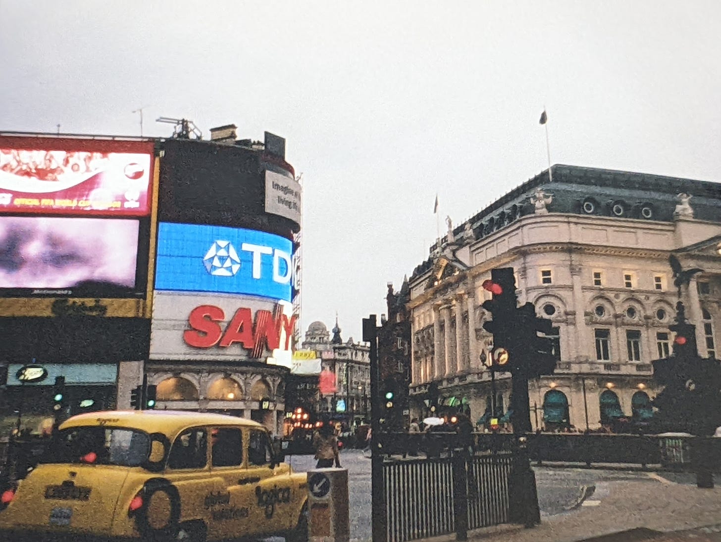
Piccadilly Circus in 2002
Photo taken by Robert Stark
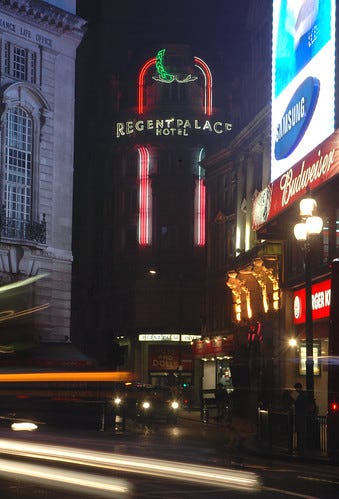
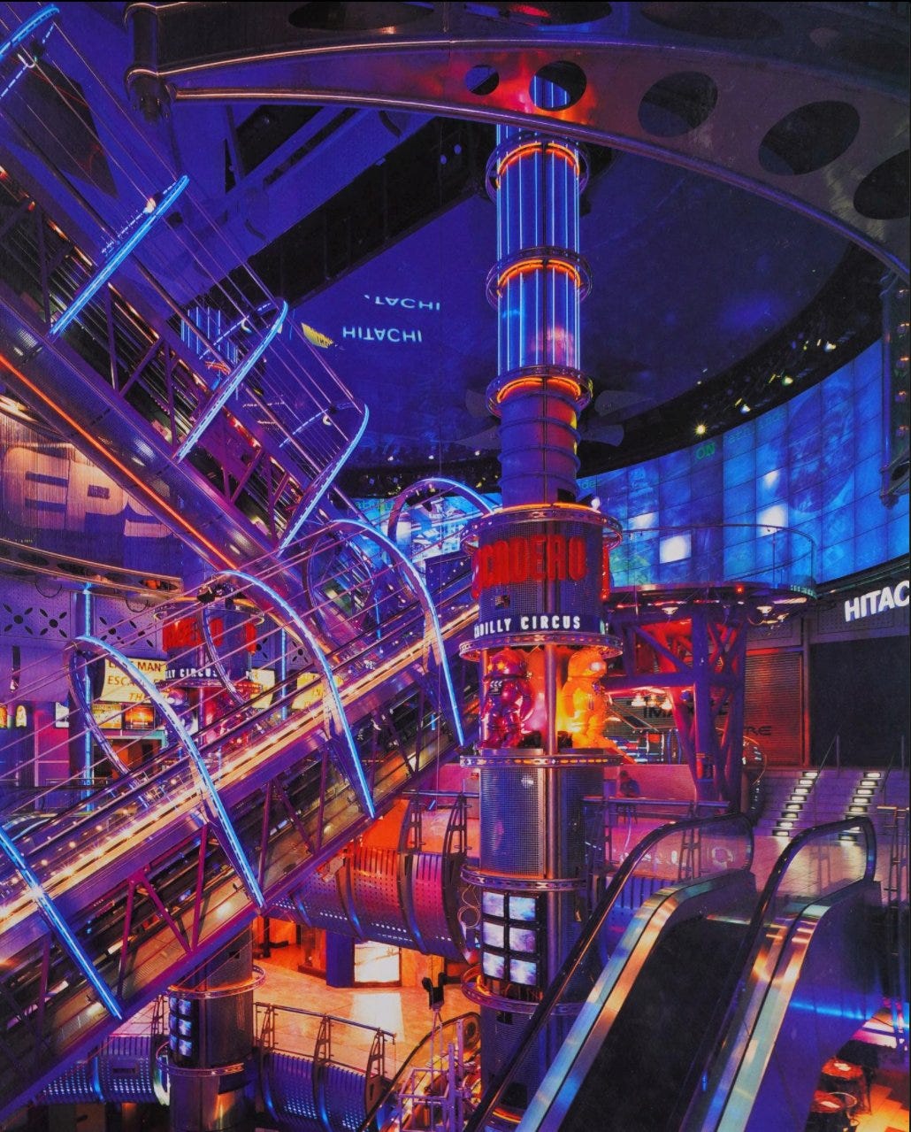
I visited London in 2002, when I was 16, right before the massive citywide building boom and final wave of minimalist renovations of Piccadilly Circus, and neighboring Soho and Theatre District. In 2002, Piccadilly Circus had already been transformed dramatically from its peak in the mid-20th century, but there were still remnants of the past, such as the Sanyo sign from 1978. Overall it had much more character than today. Changes to the area included the renovation of the Regent Palace Hotel into an office complex, removing its Art Deco Roman themed neon sign, the renovation of an adult oriented district in Soho, which did preserve and re-purpose the iconic Raymond’s Review Bar sign into a new high-end minimalist development, and the renovation of the Blade Runneresque, Trocadero entertainment complex, from the 80s into a hotel.
R E T U R N T O T R A D I T I O N
Regents Palace Hotel: source
Trocadero: source
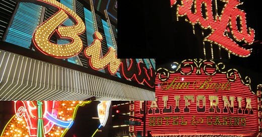
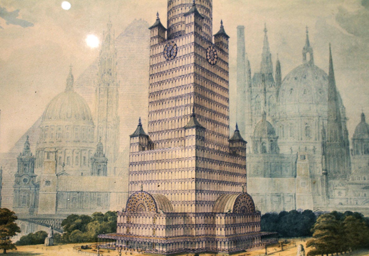
Piccadilly Circus, and London in general, lost a lot more neon than American cities, including even New York’s Time Square. This is because London’s historic preservationists didn’t bother because mid-century neon is very new by London’s standards. Newer American cities such as Los Angeles and San Francisco have actually done a better job preserving neon signage. London also embraced the banal minimalist aesthetic during its construction boom, that are associated with the 2010s. London has so many Retrofuturist genres to borrow from. For instance the retrofutrist Steampunk genre was heavily influenced by Victorian era London’s visions for the future. The Richard Roger designed Lloyd’s Building in London’s Financial District resembles a Victorian era train stations turned into a skyscraper. In 1852 there were unrealized plans in London for the world’s first glass skyscraper, made out of the remain of the Crystal Palace. The engineering technology was not ready but the design was way head of its time and strangely resembles 80s Post Modernism. One positive trend for the 2020s in London and American cities, is the increase in retro inspired architectural proposals rather than 2010s minimalism. However, with the recession and high interest rates many of these projects will be canceled.
Crystal Tower Palace Proposal from 1852
It seems that the minimalism that was popular the first two decades of the 20th Century is going out of style but what could replace minimalism could be worse. For instance the rainbow flag got a maximalistic makeover with the new intersectional pride flag. Regardless of what one thinks about LGBTQ identity politics, the new flag is atrocious from a design standpoint.
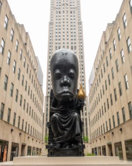
Minimalism is linked implicitly to Whiteness (eg. IKEA) and with the left becoming more third wordlist, expect to see more third wordlist inspired maximalism. For instance Sanford Biggers’ Afrocentric bronze Oracle statue at Rockefeller Center in New York. The new statue desecrates one of the most iconic Art Deco architectural sites in the world, and resembles an old school racist caricature. Not just the new statue linked to the Black Liver Matter cause, Biggers ironically drew inspiration from the Greek god Zeus, who represents gatekeeping and tyrannical power. The Biggers statue ironically obstructs the view of the art deco Prometheus statue, the Greek god of radical creativity, and the pursuit of empirical truths, who battled Zeus. There is another new aesthetic genre that has been dubbed, Neoliberal Kitsch or neoliberal realism. It is inspired by Norman Rockwell’s art but with icons of the Democratic Party, such as AOC, and woke corporate diversity illustrations.
Oracle statue at Rockefeller Center
While the 20th Century saw each decade reinvent itself, today’s culture feels stagnant alongside an overall aesthetic decline and there lacks any common, cultural, identity or vision for the future. We must reject the utilitarianism and the small mindedness. Retrofuturism, in both politics and aesthetics, can re-instill vitality into society in a way that conservatives and reactionaries can’t. Aesthetics are both implicit and explicit forms of political symbolism, and politics is really just Aesthetics tribes and aesthetic warfare.



Fantastic post Robert, I hope it gets more attention. Good heavens we live in such an ugly world now.
A peer I respect shared this article and I've tried to read this but had to stop.
You have 36 external links, not counting your 'source' links, in this essay.
Do you want readers to read your essay or read these 36 external pages?
Is understanding anything in this essay contingent on reading any of those 36 links? If not, why include them directly in the text in this way.
I mean this in the most constructive way possible but stop doing this. This is an aesthetically a terrible experience when trying to read and consume the ideas in your essay. You are risking the loss of the reader to distraction of clicking and being taken away.
If you feel these links are important just footnote them and source link at the end.